
For the repeatedly measured studies, it is important to get the whole picture of the crude data before advanced analysis. A spaghetti plot is a line plot with many lines displayed together. Each line indicates a subject’s data.
We create a spaghetti plot with the SAS PROC SGPLOT procedure
SAS code
%macro Spaghetti(cog=cog);
proc sgplot data=long;
series x=time y=&cog / group=id ;
run;
%mend;
%Spaghetti(cog=mocasco);
*Noted that the dataset should be a "long data" format.
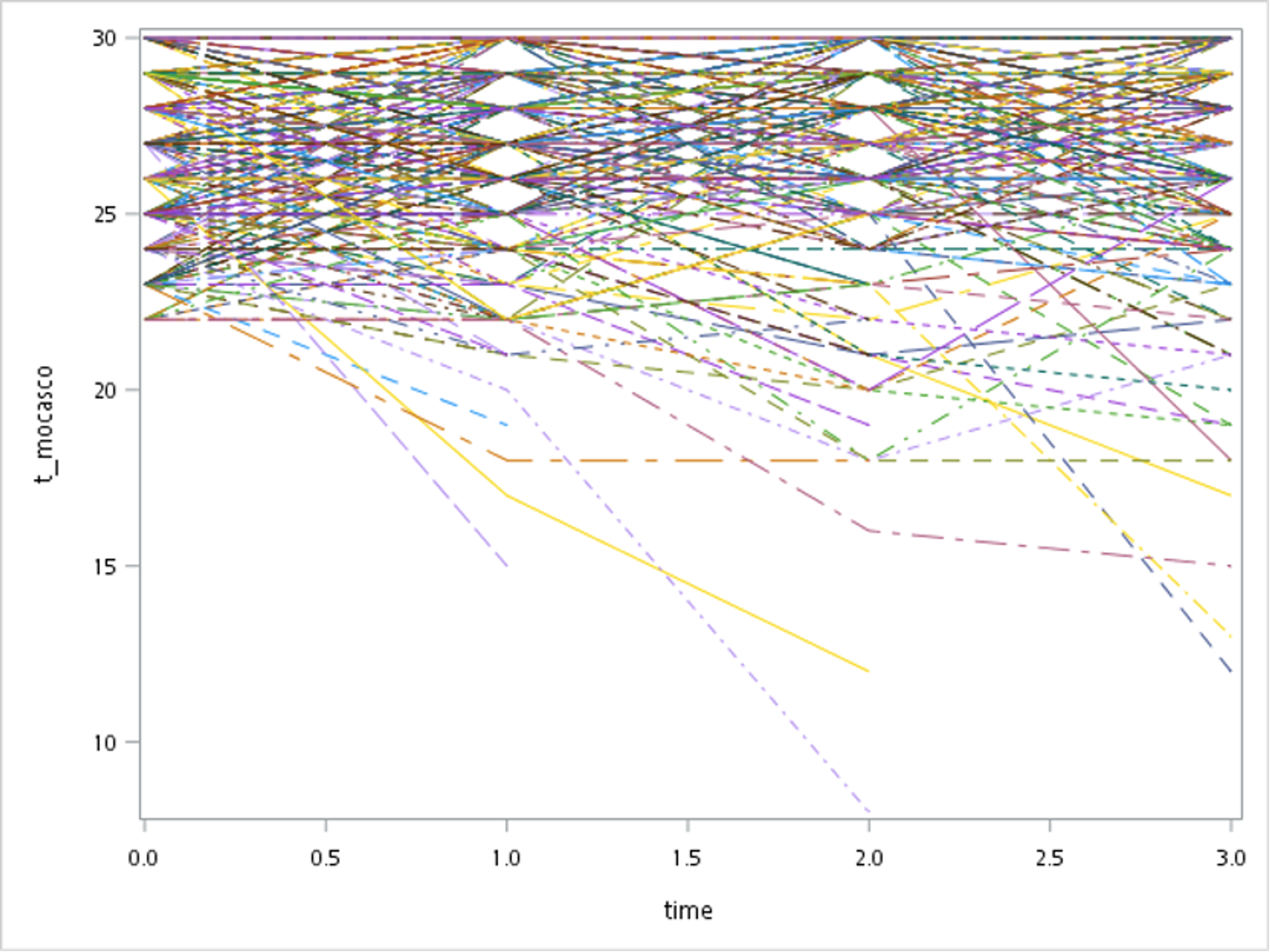
For instance, the figure below showed that each subject has been observed at four-time points. X-axis indicated the follow-up time (years), while the Y-axis was the cognitive performance for participants. We observed that cognitive function varied among older adults. Some people presented a significant decline, and others even got better which may be due to the practice effect!
Any questions? Feel free to ask!